
Search experience for a book discovery app
A seamless experience where the user will search for a book.
Project:
Personal project
My role:
UI UX Designer
Timeline:
1 day
Read time:
3 mins
Challenge
Design a search experience for a book discovery app.
Are you in a hurry?
Click here to jump to the final design
Users have different motivations to use search in a book discovery app and some of them could be:
Trying to find a particular book
Just want to explore
Want to see books of a particular author
Note
In this project, following the Stanford design thinking process was challenging due to time constraints. Unfortunately, I couldn't find the target audience to conduct interviews. As an alternative approach, I studied the market to identify the flaws in the current products .
Understanding the market
To understand about the search experience of a book discovery app, I downloaded the most popular apps available in the market.
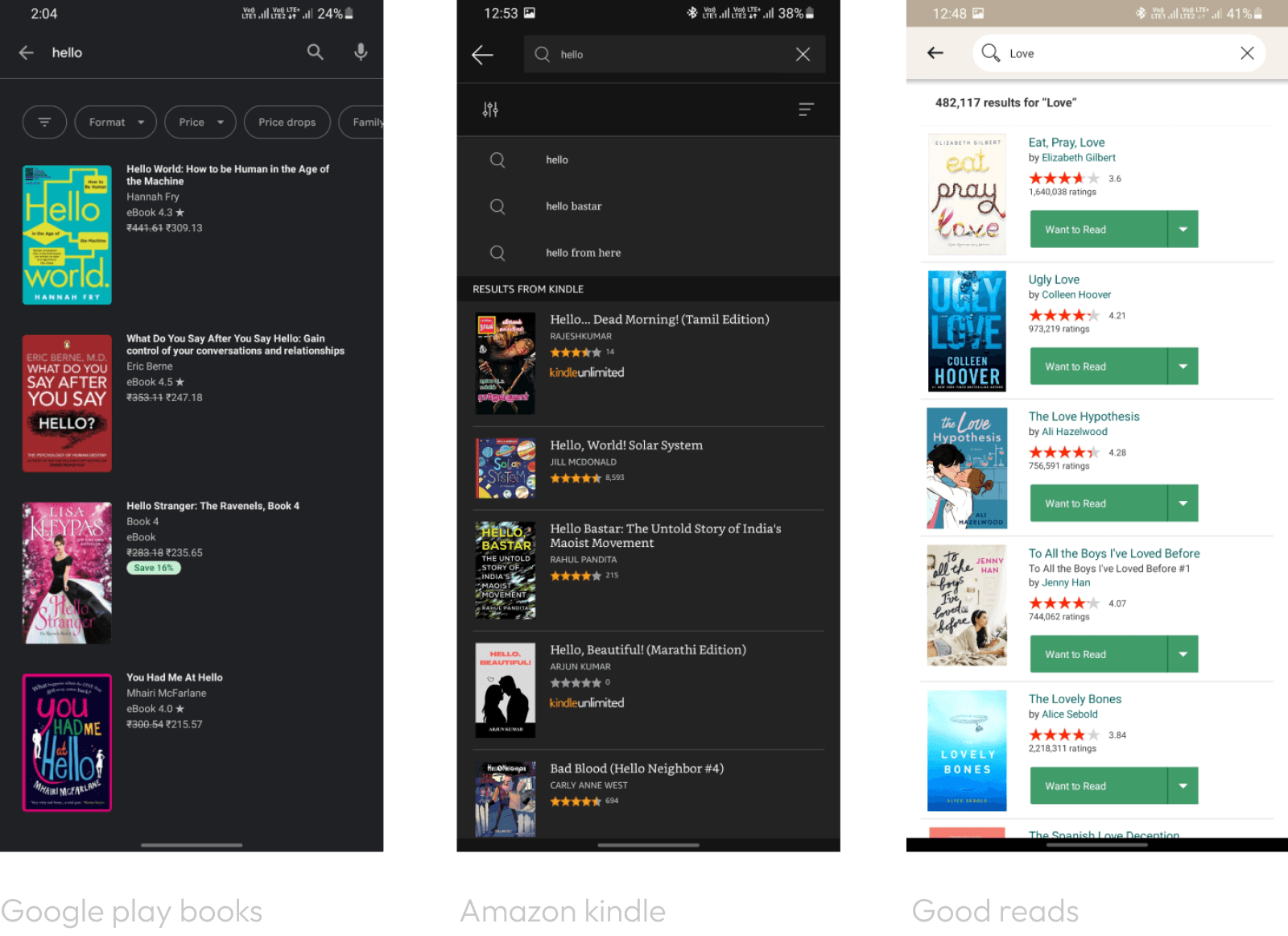
Google play books
Strengths:
The search bar has been given importance as it stays at the top of the screen throughout the UI.
Recent searches by the user are shown.
Users can also jump to different categories like top-selling, New releases & Bookshop.
Users can also search by audio input.
Weakness:
The search bar prompts, " Search playbooks" but the user can also search authors. The prompt should be rephrased.
There’s no indication of the total number of results for an input.
No sorting option in the search results.
There’s only a single view for the search results.
Empty state doesn’t provide any action that the user can take If there’s no result for a particular search.
Books ratings are shown to the user but there’s no indication of the number of reviews.
Amazon kindle
Strengths:
The search bar has been given importance as it stays at the top of the screen throughout the UI.
Books ratings & number of reviews are shown to the user.
Users can use the sort by button to sort out the results.
Suggestions are relevant to the input of the user.
Category section is important in a book discovery app and Kindle app has a dedicated button for the user to choose between different types of categories.
Weakness:
Recent searches are not shown to the user.
No audio search.
The search bar prompts, " Search Kindle" which should be rephrased.
There’s only a single view for the search results.
Empty state doesn’t provide any action that the user can take If there’s no result for a particular search.
There’s no indication of the total number of results for an input.
Good reads
Strengths:
The search bar has been given importance as it stays at the top of the screen throughout the UI.
The search bar prompt is clear and to the point.
Users can scan barcode of the books as a search method.
Clear indication of total number of results for a particular search.
Books ratings & number of reviews are shown to the user.
Weakness:
Suggestions could be improved with respect to the user’s input.
No audio search.
The user cannot sort or apply filters to the results.
There’s only a single view for the search results.
Empty state doesn’t provide any action that the user can take If there’s no result for a particular search.
The market research gives a clear idea of an ideal search experience
Wireframes
User flow: When the user taps the search bar or search icon

Colors

Typography
Icons

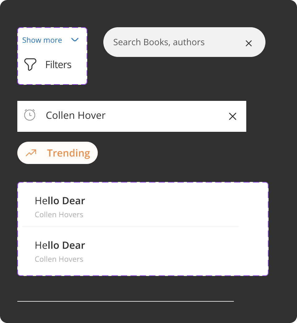
Components
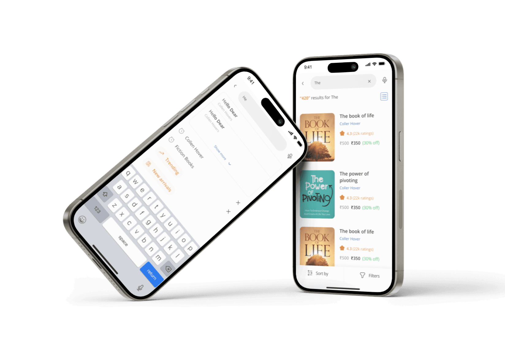
User interfaces
User flow: When the user taps the search bar or search icon
User can search by audio input.
The user can search by the recent searches and can choose from different category.

Suggestions are relevant to the user’s input with the author’s name to enhance the user experience.

Providing the total number of results enhances the user experience
User can change the view of the results
Sort & Filters buttons are placed at the bottom for easy access.

Empty state is clear and the system tries to match the user input with the data.

My other work
Upguidance - UX case study
Upguidance is an app designed to help users in their career journey.
View case study

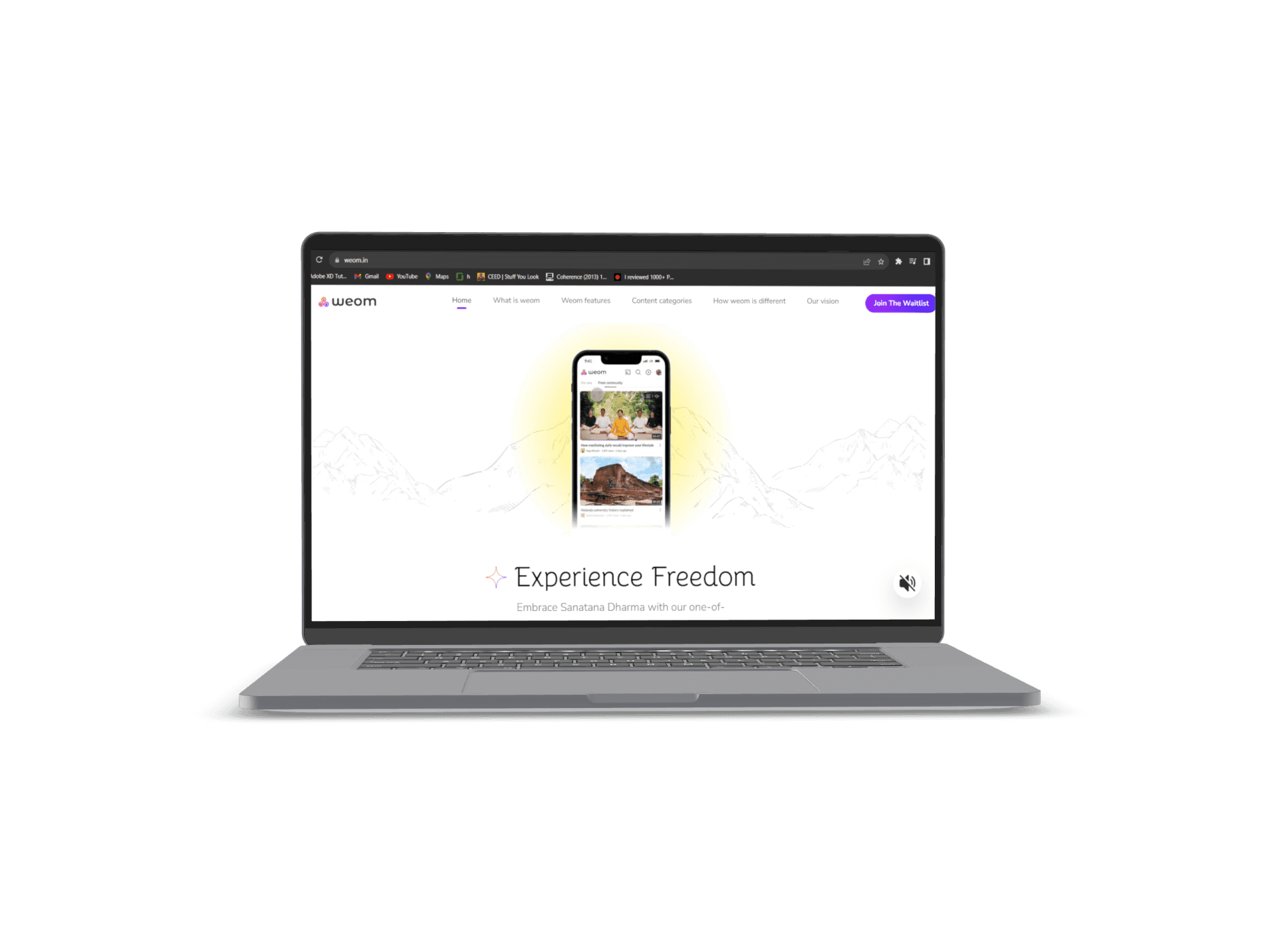
Weom landing page
A landing page for weom, a video sharing platform that revolves around Sanatana Dharma
Visit Weom.in
Search experience for a book discovery app
A seamless experience where the user will search for a book.
Project:
Personal project
My role:
UI UX Designer
Timeline:
1 day
Read time:
3 mins
Challenge
Design a search experience for a book discovery app.
The market research gives a clear idea of an ideal search experience
Understanding the market
To understand about the search experience of a book discovery app, I downloaded the most popular apps available in the market.
Users have different motivations to use search in a book discovery app and some of them could be:
Trying to find a particular book
Just want to explore
Want to see books of a particular author
Note
In this project, following the Stanford design thinking process was challenging due to time constraints. Unfortunately, I couldn't find the target audience to conduct interviews. As an alternative approach, I studied the market to identify the flaws in the current products .
Wireframes
User flow: When the user taps the search bar or search icon
Are you in a hurry?
Click here to jump to the final design
Google play books
Strengths:
The search bar has been given importance as it stays at the top of the screen throughout the UI.
Recent searches by the user are shown.
Users can also jump to different categories like top-selling, New releases & Bookshop.
Users can also search by audio input.
Weakness:
The search bar prompts, " Search playbooks" but the user can also search authors. The prompt should be rephrased.
There’s no indication of the total number of results for an input.
No sorting option in the search results.
There’s only a single view for the search results.
Empty state doesn’t provide any action that the user can take If there’s no result for a particular search.
Books ratings are shown to the user but there’s no indication of the number of reviews.
Amazon kindle
Strengths:
The search bar has been given importance as it stays at the top of the screen throughout the UI.
Books ratings & number of reviews are shown to the user.
Users can use the sort by button to sort out the results.
Suggestions are relevant to the input of the user.
Category section is important in a book discovery app and Kindle app has a dedicated button for the user to choose between different types of categories.
Weakness:
Recent searches are not shown to the user.
No audio search.
The search bar prompts, " Search Kindle" which should be rephrased.
There’s only a single view for the search results.
Empty state doesn’t provide any action that the user can take If there’s no result for a particular search.
There’s no indication of the total number of results for an input.
Good reads
Strengths:
The search bar has been given importance as it stays at the top of the screen throughout the UI.
The search bar prompt is clear and to the point.
Users can scan barcode of the books as a search method.
Clear indication of total number of results for a particular search.
Books ratings & number of reviews are shown to the user.
Weakness:
Suggestions could be improved with respect to the user’s input.
No audio search.
The user cannot sort or apply filters to the results.
There’s only a single view for the search results.
Empty state doesn’t provide any action that the user can take If there’s no result for a particular search.
User interfaces
User flow: When the user taps the search bar or search icon
User can search by audio input.
The user can search by the recent searches and can choose from different category.
Suggestions are relevant to the user’s input with the author’s name to enhance the user experience.
Providing the total number of results enhances the user experience
User can change the view of the results
Sort & Filters buttons are placed at the bottom for easy access.
Empty state is clear and the system tries to match the user input with the data.
Colors
Typography
Icons
Components
Search experience for a book discovery app
A seamless experience where the user will search for a book. seamless experience where the user will search for a book.
Project:
Personal project
My role:
UI UX Designer
Timeline:
1 day
Read time:
3 mins
Challenge
Design a search experience for a book discovery app.
The market research gives a clear idea of an ideal search experience
Understanding the market
To understand about the search experience of a book discovery app, I downloaded the most popular apps available in the market.
Users have different motivations to use search in a book discovery app and some of them could be:
Trying to find a particular book
Just want to explore
Want to see books of a particular author
Note
In this project, following the Stanford design thinking process was challenging due to time constraints. Unfortunately, I couldn't find the target audience to conduct interviews. As an alternative approach, I studied the market to identify the flaws in the current products .
Wireframes
User flow: When the user taps the search bar or search icon
Are you in a hurry?
Click here to jump to the final design
Google play books
Strengths:
The search bar has been given importance as it stays at the top of the screen throughout the UI.
Recent searches by the user are shown.
Users can also jump to different categories like top-selling, New releases & Bookshop.
Users can also search by audio input.
Weakness:
The search bar prompts, " Search playbooks" but the user can also search authors. The prompt should be rephrased.
There’s no indication of the total number of results for an input.
No sorting option in the search results.
There’s only a single view for the search results.
Empty state doesn’t provide any action that the user can take If there’s no result for a particular search.
Books ratings are shown to the user but there’s no indication of the number of reviews.
Amazon kindle
Strengths:
The search bar has been given importance as it stays at the top of the screen throughout the UI.
Books ratings & number of reviews are shown to the user.
Users can use the sort by button to sort out the results.
Suggestions are relevant to the input of the user.
Category section is important in a book discovery app and Kindle app has a dedicated button for the user to choose between different types of categories.
Weakness:
Recent searches are not shown to the user.
No audio search.
The search bar prompts, " Search Kindle" which should be rephrased.
There’s only a single view for the search results.
Empty state doesn’t provide any action that the user can take If there’s no result for a particular search.
There’s no indication of the total number of results for an input.
Good reads
Strengths:
The search bar has been given importance as it stays at the top of the screen throughout the UI.
The search bar prompt is clear and to the point.
Users can scan barcode of the books as a search method.
Clear indication of total number of results for a particular search.
Books ratings & number of reviews are shown to the user.
Weakness:
Suggestions could be improved with respect to the user’s input.
No audio search.
The user cannot sort or apply filters to the results.
There’s only a single view for the search results.
Empty state doesn’t provide any action that the user can take If there’s no result for a particular search.
User interfaces
User flow: When the user taps the search bar or search icon
User can search by audio input.
The user can search by the recent searches and can choose from different category.
Suggestions are relevant to the user’s input with the author’s name to enhance the user experience.
Providing the total number of results enhances the user experience
User can change the view of the results
Sort & Filters buttons are placed at the bottom for easy access.
Empty state is clear and the system tries to match the user input with the data.
Colors
Typography
Icons
Components