


How 90% of patients' families started tracking their bills
How 90% of patients' families started tracking their bills
My Role
My Role
Solo Product Designer
Solo Product Designer
Team
Team
1 PM · 4 Developers
1 PM · 4 Developers
Timeline
Timeline
4 Weeks
4 Weeks
Platform
Platform
iOS & Android
iOS & Android
Released
Released
7 Recovery Centres
7 Recovery Centres
CONTEXT
CONTEXT
HCAH recovery centers helps patients recover from serious conditions like strokes and paralysis
HCAH recovery centers helps patients recover from serious conditions like strokes and paralysis

7 centers across India
7 centers across India

25,000+ people recovered
25,000+ people recovered
IRIS, a patient management tool was launched
IRIS, a patient management tool was launched
In Jan 2025, we launched IRIS to help our clinical staff manage operations more efficiently. Once that system was working well, we shifted our focus to the patient and their families staying at our centers.
In Jan 2025, we launched IRIS to help our clinical staff manage operations more efficiently. Once that system was working well, we shifted our focus to the patient and their families staying at our centers.
The gap this app was built to close
The gap this app was built to close
The ground staff had a tool, the patient’s family members had nothing.
The ground staff had a tool, the patient’s family members had nothing.
The Problem
The Problem
The family members managing the patient’s care had a hard time checking and tracking bills
The family members managing the patient’s care had a hard time checking and tracking bills
Checking bills was a physical task
Checking bills was a physical task
Family members had to walk to reception every time, an unnecessary burden on people already
managing a health crisis.
Family members had to walk to reception every time, an unnecessary burden on people already
managing a health crisis.


Payments had only one channel
Payments had only one channel
Advance payments and due clearances required an
in-person visit. No flexibility, no digital option.
Advance payments and due clearances required an in-person visit. No flexibility, no digital option.
Bill line items were confusing
Bill line items were confusing
Terms like "Strength Training Charges" meant nothing to most families. Even reception staff sometimes had to escalate to the medical team.
Terms like "Strength Training Charges" meant nothing to most families. Even reception staff sometimes had to escalate to the medical team.

Who We Were Designing For
Who We Were Designing For
Two users, one journey
Two users, one journey

Mihir, 45
Mihir, 45
Patient’s Family Member
Patient’s Family Member
Primary User
Primary User
The family member/NOK manages the
patient’s finances.
The family member/NOK manages the patient’s finances.
They make key decisions during the
recovery journey.
They make key decisions during the recovery journey.
They handle approvals, payments, and
financial queries.
They handle approvals, payments, and financial queries.

Sanjay, 85
Sanjay, 85
Patient Themselves
Patient Themselves
Secondary User
Secondary User
Most patients are bedridden and rely on the NOK.
Most patients are bedridden and rely on the NOK.
Patients who are more independent are likely to use the app themselves.
Patients who are more independent are likely to use the app themselves.
RESEARCH
RESEARCH
What patient's family members and staff told me
What patient's family members and staff told me
What families said
What families said
“Checking bills is tiresome, I have to go to the reception area every time.”
“Checking bills is tiresome, I have to go to the reception area every time.”
What reception staff said
What reception staff said
"We spend a significant part of our morning just printing bills and explaining the same line items every day."
"We spend a significant part of our morning just printing bills and explaining the same line items every day."
What data told us
What data told us
Most families requested bill printouts twice daily, increasing staff workload significantly
Most families requested bill printouts twice daily, increasing staff workload significantly
Prioritisation
Prioritisation
Why billing and not something else
Why billing and not something else
Relatively low effort
Relatively low effort
As we had already built our in-house patient management tool which included billing, showing the bill on the app was relatively easier.
As we had already built our in-house patient management tool which included billing, showing the bill on the app was relatively easier.
Viewing the bill will be a lot easier
Viewing the bill will be a lot easier
Users no longer need to visit the reception area every time to check their bill; they can easily view it from anywhere on the app.
Users no longer need to visit the reception area every time to check their bill; they can easily view it from anywhere on the app.
Less interaction with reception staff
Less interaction with reception staff
By giving families an easy way to see their bills, we can cut down on the constant back-and-forth at the reception desk.
By giving families an easy way to see their bills, we can cut down on the constant back-and-forth at the reception desk.
What was pushed to phase 2
What was pushed to phase 2
Research revealed gaps beyond billing, no easy way to report issues or track daily sessions. We prioritized billing for V1 and planned these for Phase 2.
Research revealed gaps beyond billing, no easy way to report issues or track daily sessions. We prioritized billing for V1 and planned these for Phase 2.
Final design
Final design
Screens which made the cut
Screens which made the cut
Login Flow
Login Flow

Enter mobile number
“What’s your registered mobile number” removes any doubt which number the user should enter.
Enter OTP
Keyboard on both these steps automatically appears to reduce interaction.

Invalid mobile number
If a user enters fewer than 10 digits, the error message informs them to enter a valid phone number.
Number not found
If a user enters a 10 digit number that isn’t registered with us for any reason, a bottom sheet would appear with the next steps.
Enter mobile number
SCREEN 1 OF 4
“What’s your registered mobile number” removes any doubt which number the user should enter.
Enter OTP
SCREEN 2 OF 4
Keyboard on both these steps automatically appears to reduce interaction.
Invalid mobile number
SCREEN 3 OF 4
If a user enters fewer than 10 digits, the error message informs them to enter a valid phone number.
Number not found
SCREEN 4 OF 4
If a user enters a 10 digit number that isn’t registered with us for any reason, a bottom sheet would appear with the next steps.
Home screen

Users will see one card per patient. If a number is registered with two patients, they’ll simply see two separate cards with the primary actions.

This card can also be used If we decide to bring in other services to the app later.
Note
Since this was the first version of the app, I left extra space on the cards and the home screen. This was a deliberate choice to make room for new features and important updates in the future without having to redesign the entire layout.
Billing Flow

Billing details
Shows a quick financial overview with deposit, bill, and balance, along with easy access to payments.
Detailed, day-wise billing below helps users track and understand charges clearly.

Outstanding balance
Added a clear “Pay outstanding amount” alert with the outstanding balance highlighted in red, making dues immediately visible and actionable.

Bill item info
Users can tap the ‘i’ icon to see details. This cuts down on back-and-forth with staff, since families no longer need to ask about every line item.

Make payment
Users can easily pay through the app, the interface is kept similar to Gpay as it is one of the most used payment apps.

Payment history
Users can quickly review their past payments and see where their money went, which helps them verify charges, clear doubts on their own.
Home screen
Users will see one card per patient. If a number is registered with two patients, they’ll simply see two separate cards with the primary actions.
This card can also be used If we decide to bring in other services to the app later.
Note
Since this was the first version of the app, I left extra space to make room for new features in the future.
Billing Flow
Billing details
SCREEN 1 OF 5
Shows a quick financial overview with deposit, bill, and balance, along with easy access to payments.
Detailed, day-wise billing below helps users track and understand charges clearly.
Outstanding balance
SCREEN 2 OF 5
Added a clear “Pay outstanding amount” alert with the outstanding balance highlighted in red, making dues immediately visible and actionable.
Bill item info
SCREEN 3 OF 5
Users can tap the ‘i’ icon to see details. This cuts down on back-and-forth with staff, since families no longer need to ask about every line item.
Make payment
SCREEN 4 OF 5
Users can easily pay through the app, the interface is kept similar to Gpay as it is one of the most used payment apps.
Payment history
SCREEN 5 OF 5
Users can quickly review their past payments and see where their money went, which helps them verify charges, clear doubts on their own.
The blind spot
The blind spot
After launch, we saw less than 10% logins
After launch, we saw less than 10% logins
We spoke with the family members and got to know that they didn't even know the app existed. We had relied on the center staff to tell families about the app, but they were often too busy to mention it.
We spoke with the family members and got to know that they didn't even know the app existed. We had relied on the center staff to tell families about the app, but they were often too busy to mention it.
To fix this
To fix this
The Product Manager and I worked on improving app awareness so users could discover and download it as soon as their patient is registered.
The Product Manager and I worked on improving app awareness so users could discover and download it as soon as their patient is registered.

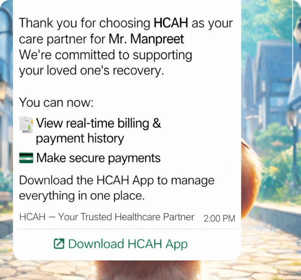
Sent Whatsapp messages
Sent Whatsapp messages
We automated WhatsApp messages to the primary family member's phone number as soon as a patient was registered.
We automated WhatsApp messages to the primary family member's phone number as soon as a patient was registered.

App posters across centers
App posters across centers
We placed posters in common areas like the lobby and waiting rooms.
We placed posters in common areas like the lobby and waiting rooms.
impact
impact
Numbers started growing after couple of weeks
Numbers started growing after couple of weeks
90%
of users checked billing once a month
Adoption jumped from under 10% to nearly 90% in just two weeks after our WhatsApp and poster campaign.
30%
users checked billing screen daily
Users are checking their bills daily, showing that we successfully built transparency and trust.
90%
of users checked billing once a month
Adoption jumped from under 10% to nearly 90% in just two weeks after our WhatsApp and poster campaign.
30%
users checked billing screen daily
Users are checking their bills daily, showing that we successfully built transparency and trust.
50%
drop in physical bill printout requests
drop in physical bill printout requests
This cut the reception workload in half. Staff now have more time to focus on patient care instead of paperwork.
This cut the reception workload in half. Staff now have more time to focus on patient care instead of paperwork.
Learnings
Lessons that I’ll take forward
Lessons that I’ll take forward
Adoption comes from value
Solving the core pain of manual billing drove natural adoption as users saw immediate value
Solve one problem well
Focusing fully on billing helped build trust, instead of spreading effort across multiple features
Adoption comes from value
Solving the core pain of manual billing drove natural adoption as users saw immediate value
Solve one problem well
Focusing fully on billing helped build trust, instead of spreading effort across multiple features
Early feedback saves time
Early feedback saves time
Early stakeholder feedback helped refine direction and focus on the most impactful features
Early stakeholder feedback helped refine direction and focus on the most impactful features

Other Work
Other Work
With constant collaboration, iterations and coffee
With constant collaboration, iterations and coffee

