Dashboard for Chief Medical Officer (CHMO)
Dashboard for Chief Medical Officer (CHMO)
My Role
User Research
UX Design
Team
1 Product Manager
1 Product Designer (Myself)
4 Developers
Timeline
3 Weeks
Read Time
5 Min
My Role
User Research
UX Design
Team
1 Product Manager
1 Product Designer (Myself)
4 Developers
Timeline
3 Weeks
Read Time
5 Min
NDA Protected
NDA Protected
Due to NDA restrictions, I’ve shared my design process and mockups in this case study. Final designs and specific details have been withheld to maintain confidentiality.
Due to NDA restrictions, I’ve shared my design process and mockups in this case study. Final designs and specific details have been withheld to maintain confidentiality.
Problem
CHMOs across our 7 recovery centers were overwhelmed with navigating multiple systems and reports to track patient progress, resulting in inefficiencies.
Solution
I designed a centralized dashboard that gave CHMOs a bird’s-eye view of patient-related updates—sessions, milestones, and documents—without digging through individual profiles.
Context
Each of our 7 centers has a Chief Medical Officer (CHMO) responsible for operations, patient progress, and compliance. Their day-to-day involves overseeing procedures, tracking patient milestones, and ensuring all documentation is up to date.
But they were losing time and focus digging through reports and fragmented systems.

Pain Points
Checking reports was time-consuming.
CHMOs didn’t check reports daily because it took too long. They had to go through different reports to track sessions, procedures, and milestones.
No quick way to view session/procedure status
Sessions and procedures are key parts of a patient’s billing and care. CHMOs need a clear way to check if these are being done properly.
Milestones were hidden deep inside patient profiles.
Milestones show if a patient is recovering on time. Right now, CHMOs can’t easily see which milestones were set, finished, delayed, or missed. There’s no single screen that shows all this.
Missing documents were only flagged if someone manually checked.
Important documents are needed for compliance. But CHMOs only know they’re missing if someone manually flags them.
Missing documents were only flagged if someone manually checked.
Important documents are needed for compliance. But CHMOs only know they’re missing if someone manually flags them.
Design Iterations
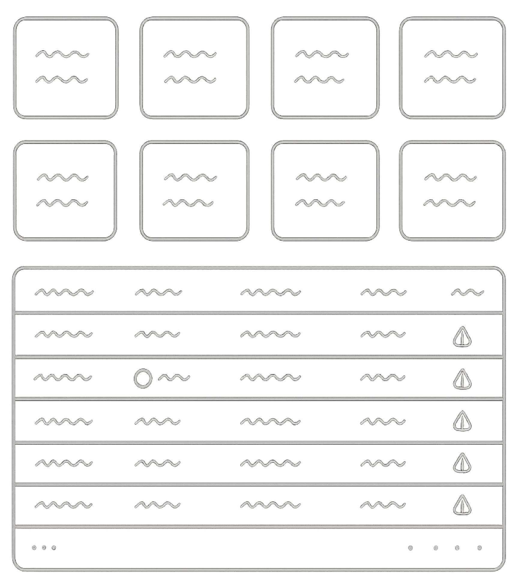
Version 1
Top sections shows separate cards for each update, like one for sessions completed, one for sessions abandoned, one for sessions missed, and so on.
This was followed by a patient list sorted by number of updates . Clicking on a patient’s name would open their profile.
Research & Insights
Stakeholder Interviews
I conducted discussions with higher management and CHMOs to understand what were their challenges & daily routine.
Pain Points
Checking reports was time-consuming.
CHMOs didn’t check reports daily because it took too long. They had to go through different reports to track sessions, procedures, and milestones.

No quick way to view session/procedure status
Sessions and procedures are key parts of a patient’s billing and care. CHMOs need a clear way to check if these are being done properly.


Milestones were hidden deep inside patient profiles.
Milestones show if a patient is recovering on time. Right now, CHMOs can’t easily see which milestones were set, finished, delayed, or missed. There’s no single screen that shows all this.
Missing documents were only flagged if someone manually checked.
Important documents are needed for compliance. But CHMOs only know they’re missing if someone manually flags them.
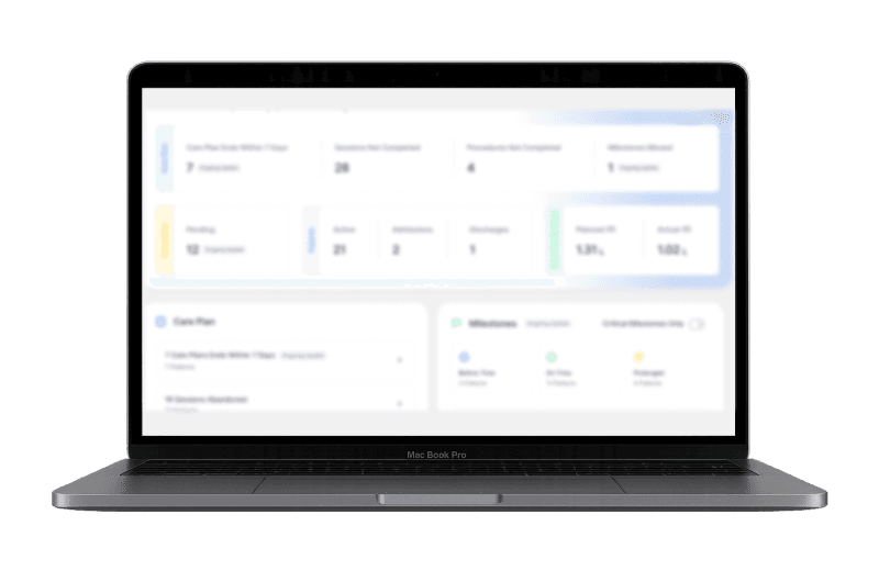
Final Version
Updates were grouped into categories, with the most important number highlighted on each card.
Next was a detailed view of the cards above, showing patient updates like sessions, procedures, and more. Clicking on an update opened a new screen listing all patients with that specific update
Wins
Much cleaner and scalable structure
CHMOs could see all patients for a particular update
The top & bottom cards provided an overall picture for low & high intent users
Why it didn't work
Cards weren’t categorized, creating visual clutter
Poor scalability as new update can be added in future
Unclear prioritization: More updates ≠ More urgent
Goal
Design a dashboard that gives CHMOs a single source of truth for their center’s updates—sessions, milestones, and missing documents—without opening individual patient profiles.
Design Iterations
Version 1
Top sections shows separate cards for each update, like one for sessions completed, one for sessions abandoned, one for sessions missed, and so on.
This was followed by a patient list sorted by number of updates . Clicking on a patient’s name would open their profile.
Why it didn’t work
Cards weren’t categorized, creating visual clutter
Poor scalability as new update can be added in future
Unclear prioritization: More updates ≠ More urgent
Why it didn’t work
Cards weren’t categorized, creating visual clutter
Poor scalability as new update can be added in future
Unclear prioritization: More updates ≠ More urgent
Unclear prioritization: More updates ≠ More urgent
Final Version
Updates were grouped into categories, with the most important number highlighted on each card.
Next was a detailed view of the cards above, showing patient updates like sessions, procedures, and more. Clicking on an update opened a new screen listing all patients with that specific update
Wins
Much cleaner and scalable structure
CHMOs could see all patients for a particular update
The top & bottom cards provided an overall picture for low & high intent users
Wins
Much cleaner and scalable structure
CHMOs could see all patients for a particular update
The top & bottom cards provided an overall picture for low & high intent users
The top & bottom cards provided an overall picture for low & high intent users
Impact
3,376 Sessions in Last 180 Days.
We recored 3,376 sessions in the last 180 days with 1,875 (55%) deep navigations. 1 out of 2 users are clicking on the updates to see the patients for that particular update.
80% Improvement in Milestone Logging.
Milestones are now regularly logged in the system for every patient. CHMOs mentioned these updates have greatly helped them in tracking progress.
6 out of 7 CHMOs Reported Improved in Workflow Efficiency.
Almost every CHMO positively reported the incorporation of the dashboard. One CHMO asked for more features & voiced some performance issues-which are fixed now.
Learnings
Faster iterations help reach the final version quicker.
Working in smaller, faster cycles helped me test and improve ideas early.
Data-driven thinking leads to better design decisions.
Analyzing actual usage patterns helped me prioritize what CHMOs really needed.
Problem
CHMOs across our 7 recovery centers were overwhelmed with navigating multiple systems and reports to track patient progress, resulting in inefficiencies.
Solution
I designed a centralized dashboard that gave CHMOs a bird’s-eye view of patient-related updates—sessions, milestones, and documents—without digging through individual profiles.
Goal
Design a dashboard that gives CHMOs a single source of truth for their center’s updates—sessions, milestones, and missing documents—without opening individual patient profiles.
Context
Each of our 7 centers has a Chief Medical Officer (CHMO) responsible for operations, patient progress, and compliance. Their day-to-day involves overseeing procedures, tracking patient milestones, and ensuring all documentation is up to date.
But they were losing time and focus digging through reports and fragmented systems.
Research & Insights
Stakeholder Interviews
I conducted discussions with higher management and CHMOs to understand what were their challenges & daily routine.
Impact
3,376 Sessions in Last 180 Days.
We recored 3,376 sessions in the last 180 days with 1,875 (55%) deep navigations. 1 out of 2 users are clicking on the updates to see the patients for that particular update.
80% Improvement in Milestone Logging.
Milestones are now regularly logged in the system for every patient. CHMOs mentioned these updates have greatly helped them in tracking progress.
6 out of 7 CHMOs Reported Improved in Workflow Efficiency.
Almost every CHMO positively reported the incorporation of the dashboard. One CHMO asked for more features & voiced some performance issues-which are fixed now.
Learnings
Faster iterations help reach the final version quicker.
Faster iterations help reach the final version quicker.
Data-driven thinking leads to better design decisions.
Analyzing actual usage patterns helped me prioritize what CHMOs really needed.


Other Work
Other Work